Wednesday, 21 December 2016

Final Audience Feedback for CD Cover, Magazine Advert and Inserts

After watching the music video, we asked the same people what they thought of our print work. 


The first question was 'Do the front and back covers match the music video?'. The unanimous response was the CD covers did match the music video. This was the most important thing we needed to accomplish because we needed our products to be cohesive. The fact that they were all agreed that it was showed that we were successful.

The second question was 'Do you think the composition of the CD covers is aesthetically pleasing?'. The audience said that the CD covers look professional and had the features of a legitimate real life cover. The quality of the images, editing and font all contribute to making our CD cover look legitimate. Legitimacy is one of the main goals of making a successful CD cover so I'd say we were successful in this aspect.

The third question was 'Do you think the pictures we have chosen work well as the magazine adverts for the music video?'. The responses were positive, they liked how we split a frame into thirds with our main characters and the polaroid effect with our other magazine advert. However they thought that Kaden should be facing the other way to make our magazine advert abit more symmetrical. We didn't really think this was that big of a problem because of how minuscule this is.

The fourth and final question was 'Does all the print work work together as a cohesive media product with the music video?'. They said that our products were very good and eye-catching. They liked that there was a reoccurring theme throughout all our products so they all seem linked. However one said that the backgrounds for our inserts were quite jarring because the Twitter theme seemed too obscuring. Postmodernism was a high priority for us so we felt adding more intertextual references would cater to the largest audience (the internet) so that explains our heavy Twitter theme.

Tuesday, 13 December 2016

Final Audience Feedback for Music Video

For our final audience feedback, we decided to gather some of our media class consisting of 17-18 year olds who are our main target audience for a video reaction for all of our finished products, the music video, the CD cover, digipak and magazine adverts.


The first question for our music video was 'What were your initial thoughts of the music video?'. The responses were all positive and they thought our story was interesting and well thought out. The narrative was one of our key ways to being postmodern because we were essentially combining film techniques with a music video. As a result, we were relieved that the audience were positive about our decision. 

The second question was 'Do you think the music video fits the genre of the music?'. The responses were mixed because on one hand people thought that since the song was more modern, our use of technology in the video was very appropriate and was a nice reflection. However some people felt that we should have stuck to the conventions of the hip-hop genre in our music video which I would tend to agree but if we wanted to be postmodern, we needed to subvert certain conventions for it to be noticeable. 

The third question was 'Does the cinematography fit with the music video?'. We got criticism over the lighting in the bar scene with Cameron because it was clear that some shots were filmed at different times, hence the difference in lighting. Although I agree that those shots look out of place, we didn't know that the lighting was so different until we were editing it and by that point, re-shooting would have taken up too much time. But overall, they said that our cinematography was solid. 

The fourth question was about postmordernism and 'How were the masks, as a motif, add to the postmodern experience?'. The audience liked the masks and added a layer of hyper reality and they liked that the masks were also intertextual references. They also said that the masks were a representation of 'anonimity in the internet' and how people can put on certain character because they are anonymous. 

The fifth question was 'How does the editing convey the narrative of the video?'. The responses were that they thought the linear continuity editing was very well done. People also liked how the editing matched the beat of the music, complying with Andrew Goodwin's theory that the visuals should match the music. Our motif of the black bar wipe at the start of the video makes the video more postmodern because it's almost parodying typical straight cuts. It can also be a parody of how Star Wars uses wipe transitions. 

The sixth question was 'Do you believe that there's a relationship between the music, lyrics and visuals?'. This relates to Andrew Goodwin's theory and people weren't sure whether there was a correlation between the three factors. Furthermore, they said that the lyrics objectifies and has a voyeuristic treatment of women, another of Goodwin's themes. However we deliberately contradicted the lyrics of the song by having a female lead searching for men rather than vice-versa because we wanted to stay postmodern therefore we added some tongue-in-cheek humour in there whilst still staying true to the hip-hop genre.

The seventh question was 'Is the video repetitive in terms of themes and actions?'. The audience mentioned the 'rule of three' where three examples is enough for the audience to understand the concept which we did try to stick to. The audience did have positive responses to this and also added that the repetitiveness of the masks and dates made our diegesis more fantasy-like, complying with Carol Vernalis' theory

The eighth question was 'Is there anything that could be improves on?'. The responses were mainly unanimous, the lighting could be better, more postmodern elements, better location, very small little improvements that could be have been solved if we had more time, money and people. The fact that this coursework took place during A-levels meant that we were limited before even starting. I feel that we did the best we could with the resources and time that we had. We were bound to encounter problems at that point in time because people are busy doing their subjects. 

Saturday, 10 December 2016

Intertextual References

One of our highest priorities in making our music video was postmodernism so we thought adding in intertextual references would be the optimal method to making our video postmodern. An intertextual reference is when a media source references another media source, usually to pay a homage or respect the source. It can be seen in the form of pastiche or parody and occasionally audience members who understand the reference will feel intelligent in doing so.


The recurring motif and intertextual reference that is prominent throughout our music video and print work is the Twitter theme which is an act of cross media convergence. With convergence, we can use Twitter as a social media platform to market our music video and establish a sense of cohesion. Furthermore, this is used as a narrative device to allow the girl in the music video to search for her dates. The Twitter theme also has an element of fantasy because every time she likes a photo, the guy appears next to her. These are all examples of hybridity, combining different genres together into one postmodern piece. 


Another example of cross-media convergence that also worked as an intertextual reference would be the YouTube overlay that we used for our music video. This broke the fourth wall and suggested to the audience that the events in this music video are not real. It questions reality and what's fantasy and what isn't. Also the YouTube video in itself is an intertextual reference to prank videos on YouTube which were a popular trend that allowed people to do cruel things to unsuspecting victims and get away with it because it was revealed to them later that it was 'just a prank'. 

The masks that the guys wear when the girl likes the photo of them are all intertextual references to other pop-culture. 


The mask that appears in this scene is an intertextual reference to Obito Uchiha from the anime 'Naruto'. 


The mask that appears in this scene is an intertextual reference to Batman, an iconic pop-culture character from DC Comics


The helmet that appears in this scene is an intertextual reference to the Kill Bill movie directed by Quentin Tarantino


Wednesday, 30 November 2016

Tuesday, 29 November 2016

Saturday, 19 November 2016

Finished Print Work including CD covers + Magazine Ad

As you can see from our print work and digipak inserts, it's not very typical of the hip-hop rap because to be postmodern is to combine different genres into a single cohesive product therefore we took inspiration from a variety of genres to reflect our postmodern music video.

Front Cover


Back Cover


Magazine Advert


Magazine Advert 2

Friday, 18 November 2016

Editing: Music Video + Print Work

We used Adobe Premiere Pro CC 2015 to edit our music video which proved really simple to use and there weren't many issues with editing. We had to split, colour correct and cut the footage that we had in a coherent manner whilst cutting between two different scenes. The music had to sync with the actor's mouths in order to look good. This was a rather simple process because we had the actors sing the song multiple times from different angles therefore lip syncing wasn't a huge issue. We edited in a wipe transition that matched the beat of the music at the start of the music video. We also edited in a YouTube overlay over our music video in a certain date segment. This was relatively easy because we just copied the YouTube design from an already existing YouTube video and then placed our music video over the YouTube video itself. We also could add in or remove anything we wanted to make the overlay more authentic. 


We used Adobe Photoshop CC 2015 to edit our magazine advert, CD covers and digipak inserts. It proved to be relatively easy and got the job done. We took all the photos whilst we were filming the music video. We cropped the photos down to a suitable size and then edited faded black bars because that's typical of singles. We also needed to edit in endorsement, ratings and the record company in order to appease the audience and to look more sophisticated.


For our first magazine advert, we cropped the three photos we took during the shooting day at the Downs in Photoshop and split the magazine advert into thirds, by placing black lines down the splits, just like with the Chad Mitchell Trio research. We then used a black fade at the bottom and the top of the magazine advert, putting white text with information. The process was rather simple, we found effective fonts on the internet and uploaded it onto Photoshop. After that, we placed an endorsement at the top, obviously not real. But it's typical of magazine adverts so we decided to.

For our second magazine advert, we added a polaroid effect onto one of the pictures. This was to create a sense of irony that old technologies are considered obsolete in today's society. However, we wanted to be postmodern therefore we used ideas from the past and incorporated it in our magazine advert.

Final Day of Filming + Digipak progress

For our final day of filming, we needed to include another date scene in order to fill up the rest of the song because we were still 30 seconds short of covering the entire song. Therefore in this scenario, the girl gets 'catfished' (definition) and she runs away and quickly unlikes the picture for the guy to disappear. The guy wears an up-side down Batman mask as an intertextual reference and adds to the postmodernism. We used a park because variety keeps the audience's interest but her sitting on the bench means the concept is still the same which is the same as Steve Neale's Genre Theory that repetition of images is key but also originality to keep things fresh. 


This is another addition to our digipak insert with a slight difference. The man is different to the man who appears in the video because of the 'catfish'. The picture is the same thing that the girl sees. The Twitter theme is present with stars in the background because it makes it seem like this is the 'perfect guy' but isn't.


Tuesday, 8 November 2016

Day 4 and Print Work progress

For our fourth day of filming, we needed to film the ending which was a continuation of Cameron's scene in the pub. The lighting was very good during this session because it gave a warmth to the scene as it's meant to be a happy ending for the girl. The process was relatively easy because we followed the same formula from the other date scenes but this time, instead of the guy suddenly appearing next to her, the guy walks up to her without a mask to portray that he's 'the perfect guy'. We also used different camera angles and shots such as over the shoulder, graphic matching and close ups in this scene to show that this is different from the other dates that she has been in. It also agrees with Carol Vernallis' theory of diegesis in that there is repetition in the music video but also agrees with Steve Neale's theory that there needs to be originality as well as repetition. Therefore this music video complies with the genre theories. Problems that occurred during the filming process was the shadows therefore most of the crew had to stand far back to avoid shadows obstructing the frame. Also there was a short time in which the lighting was a yellowish colour therefore we had to slightly rush some parts and some of the lighting was different afterwards. Overall it was a productive day of filming and we managed to get all the shots we needed.


We decided to do all our print work for this day because it was the only time where all three actors were in the same place. It's also suitable because this place is where the music video starts and ends. So it makes sense that our CD front and back cover would be here.

For our CD front cover and magazine advert, we needed to have the three main characters on the front so we took several photos of the three of them together. The one below shows the girl in the middle (Sid) to show that she's essentially the protagonist, the perfect guy on the right (Cameron) and the guy who got stood up on the left (Kaden). They are all looking away from the camera because it's a convention and that is what artists do on front covers, rarely do you see the artist look directly at the camera. They typically look away to show that they are in deep thought. It's positioned in a way that the audience would focus immediately to the middle, to the left then to the right.


The photo below would work well as a front cover too because the bench is a motif throughout the music video so it makes sense to have our three main characters sitting on the bench where they've all sat on through the course of the music video.


The picture below would work as our back cover of our CD but it could also work as a magazine advert because there is a lot of blank space to do credits and advertisement whilst also having the girl and the perfect guy and the bottom to show that it's still related to the music video. It looks very artistic in a way that they are both looking into the sunset and they are the main focus because they are in the middle even if they're at the bottom.


Sunday, 6 November 2016

Re-shoots part 3

We need to re-shoot the Cameron scene so we went back to Kaden's pub because it was too dark and some of the shots broke the 180 degree rule. We also used this opportunity to make the music video more postmodern by adding blue lighting above Cameron which creates a layer of simulation. This was because lighting was a huge obstacle because the lighting was obviously not the same as the first day when we started filming therefore adding artificial lighting would fix that problem. Also it's a convention in music videos when the singer appears to be in deep thought and looking stylish because its purpose is to attract attention to the artist. We also re-shot the part where Cameron puts on his coat and the way that is cut together because previously, that part looked very out-of-place because of the difference in lighting.

The blue lighting is also an intertextual reference to the official Foundbae music video by KYLE where in the same exact verse, there is blue lighting.


This re-shoot helped us to smooth out the edges of our music video, making it more clear and postmodern whilst also retaining some of the conventions of a hip-hop rap music video.


Tuesday, 1 November 2016

Re-shoots part 2

We needed to re-shoot the church scene because we were rushed and we decided to add in parts where Kaden (the guy who got stood up) will walk to Sid's date locations after she has already gone. We thought it would add to the clarity of the narrative because it would show that he likes the girl but cannot get to her which is a convention of many music videos to have romance aspects that don't end the way you think it should. 


Friday, 28 October 2016

Re-shoots

As mentioned from our audience feedback, we decided to reshoot the scenes where Kaden is singing in a brighter location. This way, we can also implement a wider range of shots such as close-ups, medium shots, wide shots, 'over-the-shoulder' shots which are all conventions of postmodern music videos such as Eminem - Not Afraid. You'll find that in some music videos, there isn't much variety in the camera shots. They remain relatively the same because the main focus is the artist and the song. Having low angles and high angles distract the audience and ruins the engagement between the video and the audience. The music video should be smooth and easy to follow therefore the camera should compliment that. However it could be argued that the artist's aims should be a higher priority than the audiences. With this intention, we also came up with the idea that Kaden should visit all the locations that Sid went on her dates. It adds some more interest and adds more screen time for the main singer which is a key convention in all music videos.


Monday, 24 October 2016

Day 3 + Digipak progress

For our third day of filming, we filmed at Millennium Square in Bristol. We needed to film our second 'date scene' where Sid 'likes' a picture of another boy on her phone, and the boy appears next to her. Sticking with the postmodern element of intertextual references, the boy is wearing a motorbike helmet which is a reference to Top Gear. The date seems to be going well however the boy proposes on the first date. Obviously receiving a negative reaction from Sid, she quickly 'unlikes' the photo and the boy disappears.


One of the main issues that we had filming the scene was the weather. The rain made it difficult for us to film in outdoor areas because we wanted to keep a sunny and bright atmosphere throughout the music video. We couldn't reschedule the shoot either due to some actors being busy throughout the week therefore this was the only day where the cast and crew was available. Another main issue was the public in areas that we wanted to film. We needed to make sure the background was clear of people as much as possible and we tried to keep this consistent throughout. Some things were beyond our control such as the police van in the background. However I think this filming session went rather well considering all these issues we had. We managed to get a variety of shots and we weren't rushed like before. We took our time to get all the shots we needed and wanted. We took multiple takes of the scene to get the scene just right. 


Like before, we took pictures of the guy who went on the date for our digipak inserts. This is a simulation, a postmodern element where the distinction between media and reality has collapsed because the guy is wearing a helmet in a date picture which is definitely not typical of what dating apps are like. You usually see people without wearing things that cover their face. The helmet itself is a reference to Kill Bill and Top Gear. Again, this is the same picture that the girl sees on her phone and with the previous insert on day 2, it's simplistic and has the Twitter theme.


Saturday, 22 October 2016

Audience Feedback for Magazine Ad Mid-production

These are our magazine adverts that we have made so far, they are rough edits and not the final product. We asked eight 17-18 year olds what they thought of the magazine adverts and below are their responses.

Magazine Ad 1

Magazine Ad 2


2. What do you like about our magazine adverts? (multiple choice)

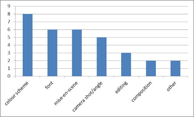
What do you think we should improve on? (multiple choice)

From the audience feedback, we decided to focus on improving the colour scheme, the font and the editing of our magazine advert. We felt that we shouldn't try to change the mise en scene, camera shot/angle and composition because not only was it popular amongst our audience, it is also incredibly difficult to change it having already taken the photos. Since it was 50/50 for both our magazine adverts, it meant that we were going along the right lines in our magazine adverts because they're both equally as good.


Audience Feedback for CD Covers + Digipak Mid production


What do you like about our digipak inserts?


What do you think we should improve on for our digipak inserts


What do you like about our CD covers?

What do you think we should improve on for our CD cover?


From the results of the audience feedback for our CD covers, we decided to focus on improving the colour scheme, font and editing. I think these are the primary features we need to improve in order to achieve the highest grade possible. They are the essential parts of the CD cover and if those three key factors are not optimized then we won't feel satisfied. It's difficult to change mise en scene and camera shot/angle because we have already taken the pictures and it would be too late to change this late into the process. Since mise en scene was the highest part that people liked about our CD cover, we wouldn't change it anyway.

From the results of the audience feedback for our digipak inserts, we decided to focus on improving editing and composition because personally, I also feel we need to make the inserts more appealing. Colour scheme was relatively popular amongst our audience therefore we will be keeping this blue colour scheme because if it isn't broken, we shouldn't fix it. 


Friday, 21 October 2016

Audience Feedback for Music Video Mid production

We showed fellow pupils aged 17-18 what we have filmed and edited so far in our music video and this is the video:


Here are the responses to the video with audio interviews:


From the interviews we can hear that nearly all of them said that the lighting was too dark for some of the scenes with Kaden singing. Lighting plays a huge role in music videos and can determine the mood and atmosphere of the scene. If the audience cannot see what is happening in the scene then we cannot convey our message across and the artist will not be seen. Therefore we decided to reshoot that part in a brighter location so the audience can see more clearly and so the main singer gets recognition as it's typical of music videos. We also decided to include more intetextual references as suggested by the audience so we're going to put more masks which have hints towards other media and more references (such as Youtube and Twitter) to other pop culture. There was a relationship between the music and the visuals especially with the coat wearing shot therefore we're going to include more shots that sync with the music's beat which shows that it complies with Andrew Goodwin's Six Features of a Music Video. It was essential that we focused on Andrew Goodwin's theory because if the music video didn't fit with that theory then according to Andrew Goodwin, it wasn't a music video. The narrative is obviously unclear because the music video isn't finished yet however people liked the music videos based on performance alone and music videos are infamous for having unclear narratives therefore the narrative does not need to be coherent in order for the music video to be good. From prior audience feedback, people don't find music videos to be necessary so that reinforces my point. The fact that our music video is not typical of a hip-hop music video shows how postmodern our music video is because despite using some conventions of the hip-hop genre, we made it more original and combined a variety of postmodern elements.

Thursday, 13 October 2016

Day 2 + Digipak progress

For our second day of filming we needed to film the second date scene so we figured that a park would work really well to set the scene. It also has bright vibrant colours so it makes things visually more clear. We used the outside of St Mary Redcliffe Church to film this scene. I think the shoot was rather rushed as we only had an hour to film due to people having busy schedules. However I think we got the essential shots done which is the most important part.


We had a bench where our female lead sat on to browse through her phone to select her 'ideal man', she would click 'like' and the man would appear next to her. I think this is a neat little postmodern element bringing some simulation into the music video. We mainly used close-ups and wide shots in this scene to give the audience a clear view of what is happening. Sid's (our female lead) bag gets stolen during the date by a thief, the 'ideal man' chases after him however when he returns, it is revealed that the whole thing was a prank and was set up by the man and the thief. Sid then 'unlikes' the 'ideal man' on her phone and both the man and the thief disappear. In my opinion, the way it was shot was rather cheesy however I think this is very postmodern as it is bringing intertextual references and rather parodic of prank videos that are on Youtube. There is meant to be a comedic tone to this scene therefore not to be taken seriously.


Furthermore we managed to take some shots for the digipak inserts of our CD. We also edited it to create a simplistic yet stylistic approach to the inserts. Inserts are typically simple and something extra for consumers to look at because the main priority is the front cover and the back cover. This is the same picture that the girl sees in the music video so this insert creates a link between the product and the music video which is what consumers want. The mask is an intetextual reference to a Japanese anime series called Naruto. The character is also very comedic so it makes sense to include it and would attract a wider audience.


Wednesday, 12 October 2016

Planning Day 2 + 3 of filming

For our second and third day of filming, we need to get Sid to go on dates with two people but they go horribly wrong in the most random and postmodern ways possible. The picture below describes each event and how we are going to film them.


Tuesday, 11 October 2016

Day 1 of Filming + Initial Ideas for Print Work + Digipak

We filmed at the Black Swan pub to get the beginning scene and the second to last scene done. We slightly changed our idea from the storyboard and decided to use more than one location for our music video therefore the majority of our music video will take place in other locations. It was rather rushed because we were short on time. Also the area in which we were filming was quite dark therefore some of the footage that we got was unclear. Filming Cameron's part was the main priority which we managed to do with ease. There were problems with trying to sync his mouth to the lyrics. However one of the main ideas in our music video is the use of the phone and how the girl (Sid) likes a photo of a boy and they will appear. Therefore we implemented that idea to the reason why Cameron is looking down at his phone, because he's checking whether she has liked it or not. 

We used a variety of camera shots and movements in our scene including arcs, medium shots, close-ups, tracking shots and made sure Cameron (the singer) was in the centre of the frame at all times because that is a key convention in hip-hop rap music videos. 

The scene itself is an intertextual reference to the official music video by Kyle - @Foundbae where the camera arcs around the singer. 

Here is an unfinished edit of Cameron's scene.


As you can see, it's very unfinished and some shots look very dark in contrast to other shots. I think that we may need to reshoot some of his shots to make it all look good. Colour correction will play a big part in our editing

We also filmed some of Kaden's date scenes which would be intertwined with Sid's dates since there will be jump cuts between each scene. However the location was just too dark to work therefore Kaden will film his scene on his own because it doesn't require many people to do his scenes. I do think that we learnt from this experience and will use this as a basis to film our other scenes. 


Print work ideas

In addition to getting the filming done, we also had time to get some pictures for our print work. We decided to use the two main guys for our pictures, Kaden and Cameron and they can represent a 'two sides of the same coin' kind of thing. The first picture is a rough idea of what we are aiming for with Kaden looking like an average person staring into the camera with a straight face. It's not very typical of CD covers so we might not use that picture. On the other hand, the second picture below is very typical of CD covers because the artist is not looking at the camera and there is a good contrast between light and dark. There is also a smugness to his facial expression and he is wearing the same clothes as in the music video therefore the pictures provide a link between the CD cover and the music video which is very typical of normal CD covers. 


Ultimately, we decided to come up with a simplistic and stylistic idea for our CD inserts (Digipak) which involves a picture of the date guy that is the same as on the girl's phone with a Twitter theme in the background to show that it's related to the music video. As with most inserts in CD's, they don't have much information and are an extra touch along with getting the CD. Therefore we chose something that is nice to look at and a neat touch.


Monday, 26 September 2016